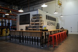
In 2015, we were introduced to three founders with a plan to launch a brewery that embodied the spirit of exploration, the city of Somerville, and beer. Together, we worked to develop a mark that communicated the unique elements of their vision in a way that was understandable and memorable. At first glance, the icon can easily be identified as a beer can tab, but upon further inspection, an Aeronaut in a hot air balloon can be seen floating above the horizon in the negative space. The icon’s portrayal of Aeronaut’s core identity along with its graphic flexibility allow it to be utilized on its own, but also in tandem with the brand’s logo as the “O”.